Menu
Client
fly uX
My role
UX design
a faster, easy and intuitive new airline app
I completed this project as part of attaining a diploma in User Experience design at the UX design institute.
the problem
The start-up airline, Fly UX were looking to create an online experience that is fast, easy, and intuitive: one that’s based on a deep understanding of their target users.
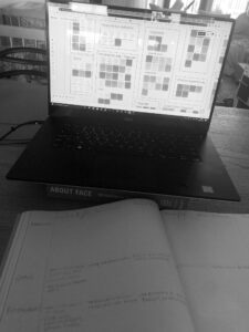
Note taking
Pain points noted from 2 usability tests
“But that has moved me to the 2nd November, for some reason”
lost in the process, doesn’t know she’s on the return screen. The transition between screens wasn’t noticed and the screen state not clearly labelled.
“A lot of reading..(she grabs her glasses)”
Lack of interest in reading lots of text. Wants a quick summary, to know most important benefits for an extra 30 euros. The text is small and grey. This is a common occurrence to decipher the importance of content.
“Say if I hadn’t wanted to book my seats, I’d have booked a flight for the best part of 500 pounds”
.. To then find it was an indirect flight. There was no flight summary detailing an indirect flight. This is a major flaw. The user would book elsewhere.
Play Video
Usability testing
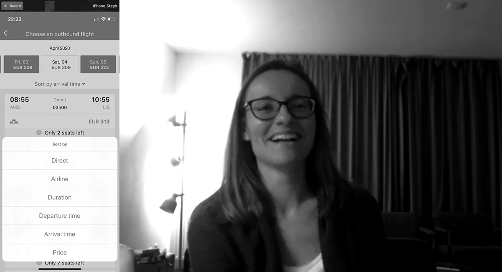
I conducted two comparative tests (using Camtasia and Refector 2), asking the user to book a flight using both the RyanAir and KLM airline apps. Editing these with Adobe After Effects and Premier Pro. The test also involved an interview to get some background info on the goals, context and behaviours.
The booking scenario:
• You live in the Netherlands. You’re planning a getaway city break.
• You think Lisbon in Portugal could be the place for you.
• Half term break starts on Monday, 30th March. And runs until Friday, 10th April.
• 13 nights / 1 person
• Your first choice is to fly out the Saturday, But you’re not too constrained by dates
As soon as the KLM app was opened the user was immediately confused where to start the booking process. The home screen assumed you already had a flight and the big CTA button brought the user to a screen where they are asked to type in their flight reference number. Clear simple language needs to be used correctly, especially for international market that KLM has.
A severe pain point was finding out that the user nearly booked an indirect flight. It says here, 1 stop, “but you’d easily go by (miss) that”. This needs to be clearly stated. Users are not very forgiving and immediately choose to leave the process. On the KLM app the option to sort flights by direct flights confuses the user. A direct flights only checkbox is suggested so that the user doesn’t have to change that later. Perhaps an option to select direct only flights should be clearly defined as soon as you start your search.

Conventions: Back button, Toolbar of 4/5 options, Defaults as a return journey and the option to compare flights with days before/after.
Surprises: Accessibility design was minimal. Microphone icons were existing but not working.
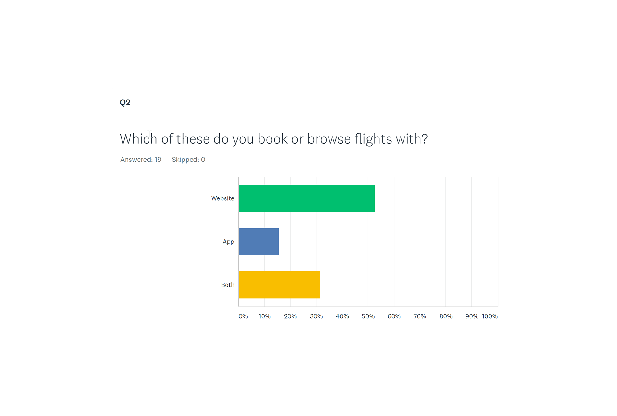
Results showed that they only use airline apps/websites once every few months. Then I wonder if an app is justifiable in terms of cost.
The main goal was to check price or check in. Several users feel there should be fewer requests for extras, it slows the booking process down.
More than half of the users book/browse on desktop website. They found the app/website easy to use. How can I pursuade the use to book on a mobile?

analysis
To analyse the data I worked on an Affinity diagram and a customer journey map.
During Covid-19 lock down I took the opportunity to collaborate with two other students on the Miro board. Whilst sharing our research we identified several patterns and themes, which we broke down into more detail. Research showed that several users browse or use aggregator apps/websites. The ability to compare is very important. I am however designing for a new airline. Later, I suggest the option to make notes of your previous search and a saving button with the feedback that the price won’t increase when saving (because some users are concerned about this).
From the affinity diagram; I had plenty of detail to write down, categorising into the goals, behaviours, painpoints and mental models on paper. While laying it out in Adobe Xd I broke the map out in to more detail; actually making a note of ideas to include at different stages in the process.
This map captured the reality that users often leave during the booking process for different reasons such as; to compare flights (prices and times/dates), to think about it and/or they’re not in a hurry. The convention of a save button, but then making it automatically save whilst notifying the user seemed like an effective way to flow through the process.
A lot of small grey text is displayed and not read. This should not be used when displaying whether it’s a direct flight otherwise it gets ignored.
Users are also confused about what stage they’re at in the process. CTA’s need to be labelled more descriptively.

design
It was important that the ideas I learned from my analysis came together in a less is more flow. The temptation is to add in lots of features which will kill the clarity of the product. My goal was to design an intuitive app that can be customised by the user or the app would suggest customisations based on their history.
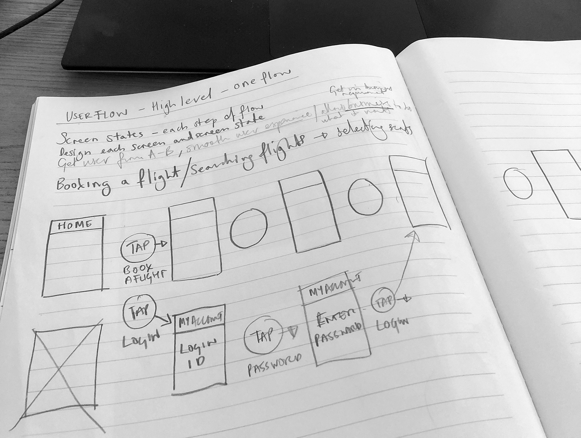
I defined the high level flow for one primary use case of booking a flight on paper and then Adobe Xd.
I wanted to integrate a human centered design approach, for several reasons:
Already have some questions with default answers, save the user time and achieve their goal asap, making it an easy process. With clear communication.
Delight the user, make suggestions, thinking with them. Giving feedback that helps makes it intuitive.
When logged in, the home screen will suggest that you can search based on a previous journeys you made. You would skip ahead in the process allowing it to be fast.
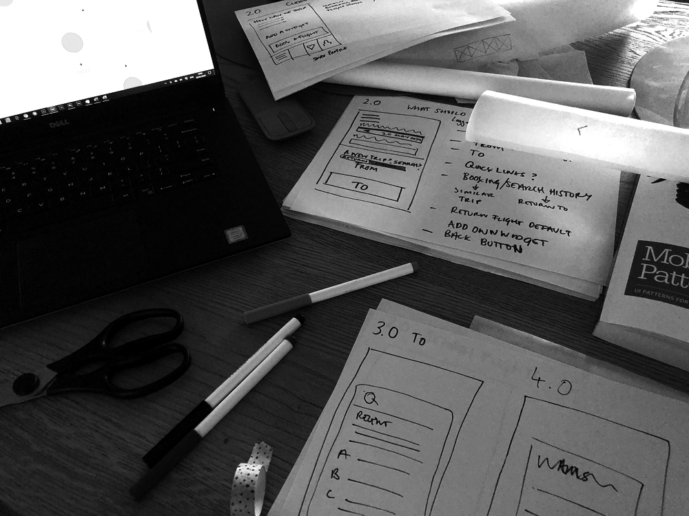
Sketching the layouts out helped me to focus on the essential use cases in the booking process.
I used tracing paper to map out 6 different layouts for each screen. I took different best practices and conventions into consideration. For the menu I summarised that a toolbar would be the best fit, considering the content needed and how often they are used in airline apps.
I included the option to filter before the search. Making sure a direct flight tick box was available. Adding in some widget suggestions like a time bracket they’d like to fly in. I suggest this because the research showed some users like to avoid early and late flights
This needed enough detail and interactivity to test the high level flow, the screen layouts, text, and basic interactions. I created the digital screens in Adobe Xd; including the interactions.
I thought certain feedback could help with certain mental models:
“Hidden costs” telling the user that this is the final price.
Users are keen to know the price as quick as possible. In the home screen I already suggest a price based on the users flight history. From prices are shown in the date selection screen.
Users remarked on the process being long and loosing track in the process. This might not just be because of unclear CTA’s but also. I wanted to test how they would respond to the flights as a package.
testing
Scenario:
• You live in Amsterdam.
• You’re planning a trip to visit family
• In Rome, Italy
• You’d like to book around the 13th to the 27th February
• You’ll be there for two weeks
• Your first choice is to fly out the Saturday

My first test, with Maartje, highlighted two important issues.
Maartje wasn’t sure where to start on the home screen. She looked at the personalised widget options and didn’t notice the big search flights button. She proceeded to try and click through the menu button to search flights.
Maartje didn’t know the details of her return flight. She missed the information. In this case the package flight in one screen creates confusion. I would return to the convention of keeping these separate.
Maartje didn’t appreciate assumptions the app made e.g. the highlighted upgrade.
She was delighted with the helpful approach of the app e.g. being offered the same seat back.
I made some adjustments and did another test with a different user; Conny.
I included less text in the upgrade and used additional icons I made the extra filters a stronger shade which Conny selected after asking if it was editable because it’s grey.
Conny and Maartje weren’t sure about the words inbound/outbound, perhaps different words would be better. However, English isn’t their first language.
This created significant feedback to adjust the booking process again.

CHECK IN & BOARDING PASS
These are included because they were popular items in app usage
Default Return
Joining the best practice. It's automatically a return flight.
MAP SEARCH
Users like to be inspired or look at the location of the destination
outcome
Certain behaviours during user testing helped to tweak interactions to allow for a smoother flow.
My next step would be to design a high fidelity interface. Testing the search flight button that Maartje couldn’t find in the first user test.
The users seem delighted with feedback and forthcoming suggestions. Which I included (along with rules) in the wireframes for the developer to understand clearly.
what i learned
This process identified that the users goal is to book flights as quickly as possible. It’s a goal focused app, the user wants to find out their information or take an action in a quick, clear and smooth process.
Next time I would like to involve card sorting in the project to understand the specific categories users identify with and their mental model.
Personas were deterred in this process. However I think this would help after producing a customer journey map to allow for a smoother flow and prevent getting feature heavy.